PayQwiq
Tesco's new 'Pay & Collect' app
PayQwiq is Tesco Bank’s digital wallet app that lets customers pay with their phones in Tesco stores while collecting Clubcard points. It was a very innovative concept for Tesco, and I am glad that I had the chance of working on such a challenging project in a time where mobile payments are still relatively a new idea.
I joined PayQwiq's Product team as a contractor in June 2015 and spent 6 months covering the role of Lead UX Designer and Researcher.
When I joined the team, the app was in beta with a user base of 1000 selected Tesco customers in London and Edinburgh. Over six months I worked on several aspects of the app: I refined the MVP for the full London launch in December 2015, including the complete redesign of the Information Architecture and the navigation; I also developed the concepts for new features, including geolocation and transactional features, and run several user testing sessions in lab and in store.
Onboarding customers from download to signup
I started at a crucial time for the app: the product was fully working but the feedback received from the pool of beta users was not exciting. Market research showed how potential customers found the concept appealing but the numbers from analytics and the qualitative feedback gathered through user testing did not match the team’s expectations: customers seemed sceptical and confused about the practical benefits of the app.
In particular, it emerged that many customers did not complete the sign-up after going through the three initial intro screens. The qualitative feedback showed how customers flicked through the text-heavy screens and did not really pay attention to the headlines “Simple, Speedy, Secure”. Many said that at the moment of sign-up they were still not sure what the app did, adding that they were expecting to see some more helpful content before reaching that stage.
I summarised the research insights and did a benchmarking of the intro screens in other similar financial and transaction-based apps to see how others tackled the problem, then I facilitated a design workshop with the team members closer to the product (Product Manager, UI Designer, Copywriter) to generate new ideas.
This was a new approach for the team, who had worked in a more waterfall fashion so far, and it wasn’t an immediate success.
The previous months had been difficult for them, with continuous design changes and little testing, so there was a general feeling of discouragement and little trust in further change. It took a few iterations but in the end, we agreed on the key communication objectives of the intro screens and on the design changes needed to make it more engaging.
The new intro screens had to:  Help customers understand how to pay Explain the key features Pay and Collect Build up the emotional engagement to start using the app
Mostly, we wanted the new intro screens to work as a handshake with our new customers, a way of informing them on the app’s key features, increase trust and create a sense of anticipation so that they’d be more encouraged to complete the set-up.
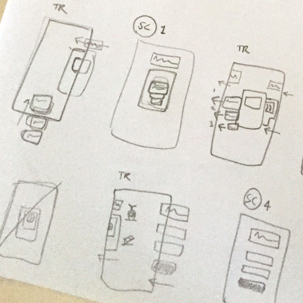
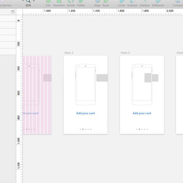
I explored these points by sketching out the new screens and the transitions, then I put together some wireframes in Sketch and, once we were all happy with the design, I created an interactive prototype with Proto.io.


The design and the contents were iterated over a few rounds of testing. The feedback we received from our customers was luckily much more positive. The new transitions created a more natural flow from the intro to the signup, while the more outstanding headers made it easier to get the content in a glance.
This is the final version of the intro screens after it had been refined by our UI Designer:
This first project allowed me to introduce a more agile approach to design in the team: an initial round of sketching to set the foundation of the concept, a set of wireframes to explore the actual workflow of the concept and the interactions, the creation of a fully interactive prototype, testing with users and iteration, where each stage is followed by a review.
I found this process to have great benefits in this specific context: it brought the team together, making everyone not only aware of the design strategy but also able to provide their input while, before, design changes were processed in a top-down way and implemented in a silo. It also made the design workflow more lean, because it made it easier to identify the stage of the implementation and to move things forward.
Introducing Proto.io as a prototyping tool was also a hugely helpful innovation. I chose it because, at the time, it was the only tool that allowed to create animations and transition with simple drag and drop tools, exactly what I needed to quickly give life to my wireframes so that I could show the rest of the team, especially the developers, how the new concepts would work in real life.
A new navigation and home screen for MVP
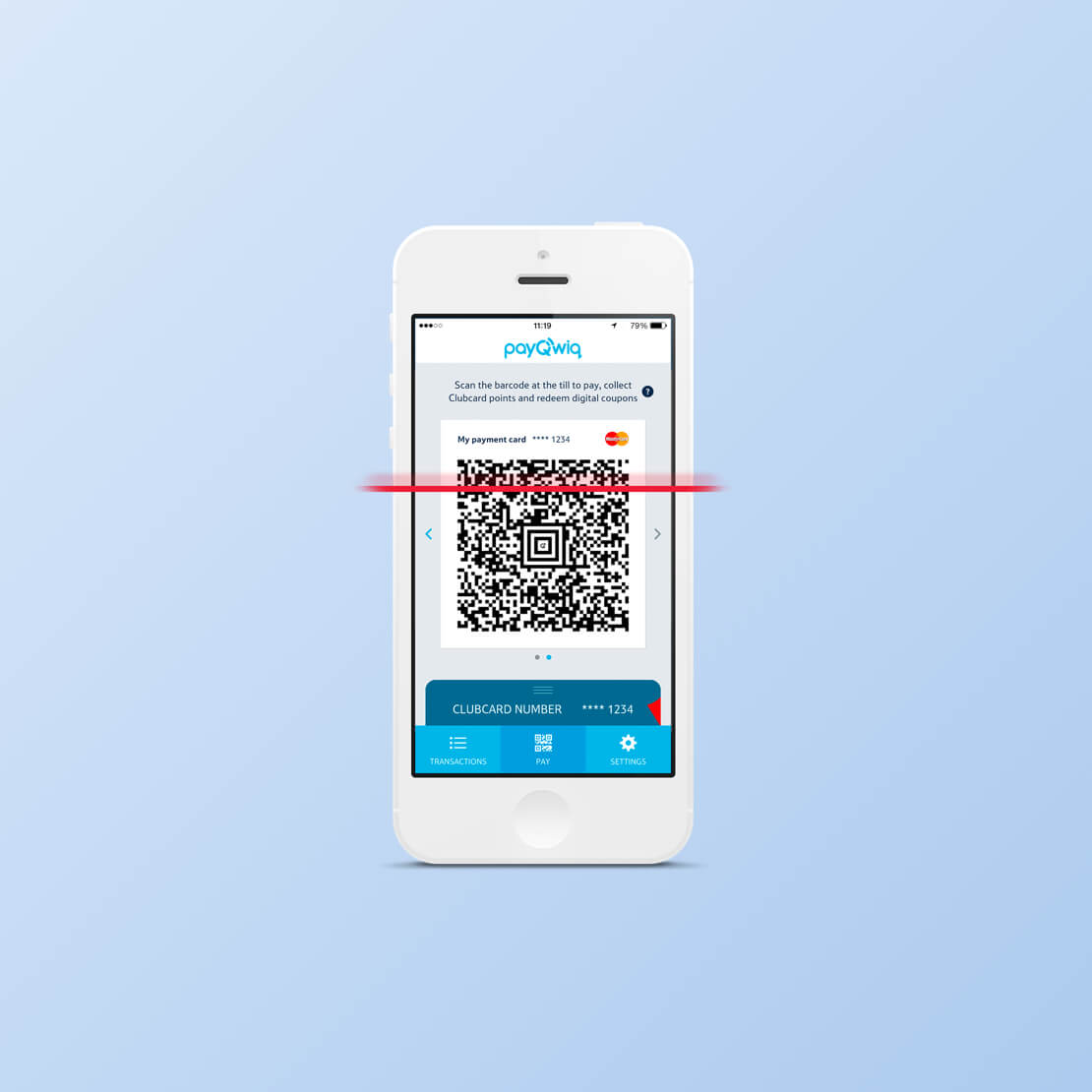
Once we saw an improvement in the more immediate problem of getting people to sign-up, we decided to proceed with a more extensive review of the app. This proved to be quite a challenge since a comprehensive map of the app did not exist and several versions of the UI had been released without keeping track of the changes.As I proceeded with my research, it became obvious that the key user journeys were too long and clumsy, with several superfluous steps and some abrupt interruptions. For example, the initial design of the home screen prioritised the view of the card's information, and the payment barcode had to be generated by tapping the 'Pay' button.

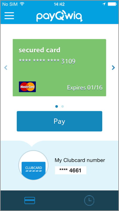
Old version of the Home screen

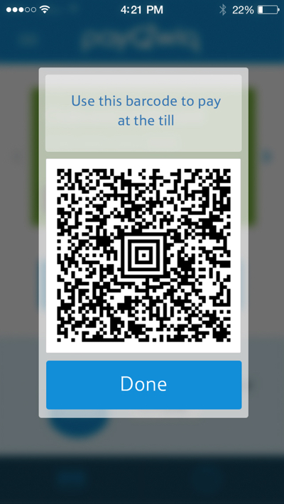
Old version of the barcode screen
I started working on the key workflows and came up with a new navigation and home screen for both the iOS and the Android apps.
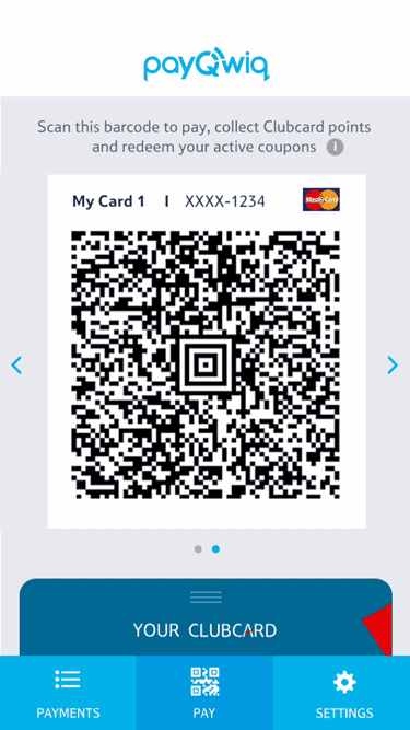
The new home screen worked much better during user testing. One of the main improvement was that it helped our users to understand immediately how to use the app once they finished the set-up. By prioritising the barcode on the screen, we made it clearer what the app was for.
The metaphor of the card drawer that could be pulled out to display more information was also an improvement. Especially, it made the association with Clubcard more intuitive and helped customers understand that they would collect automatically their points at each PayQwiq payment.
Another change was to replace the hamburger and side drawer in iOS with a bottom tab. During testing with iOS users, we usually saw the side drawer performing poorly. Most users didn’t notice it so, when asked to perform a task that required going to another section of the app, they were lost and could not complete the task. We saw that many were spontaneously looking at the bottom of the screen to find a clue, so I tried with a bottom, tabbed navigation bar, an element more in line with Apple’s guidelines.
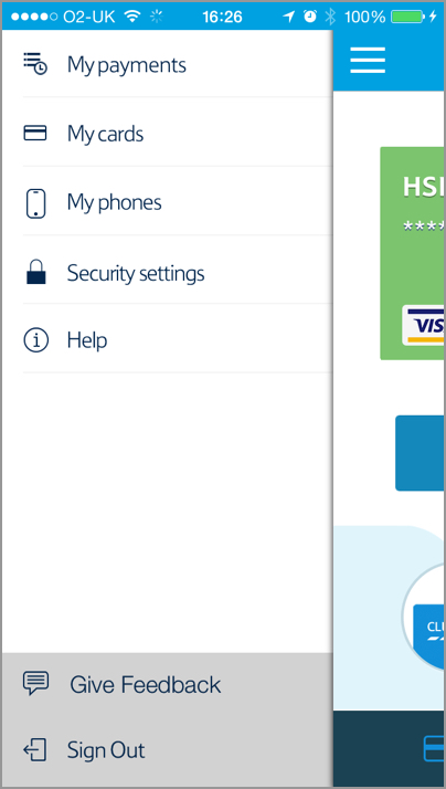

Old version of the drawer menu
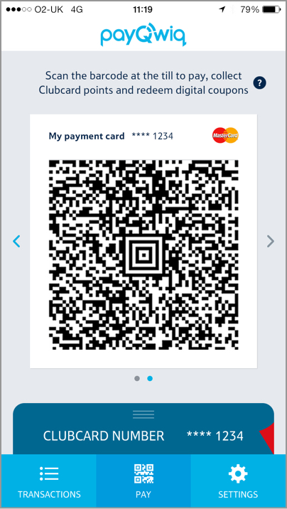

New navigation bar
After seeing how this new navigation model greatly improved the app’s performance during user testing, I started experimenting alternative solutions for Android’s navigation too.
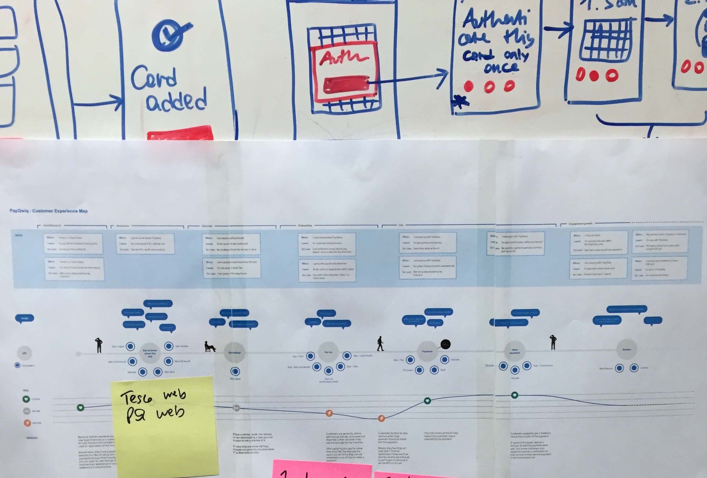
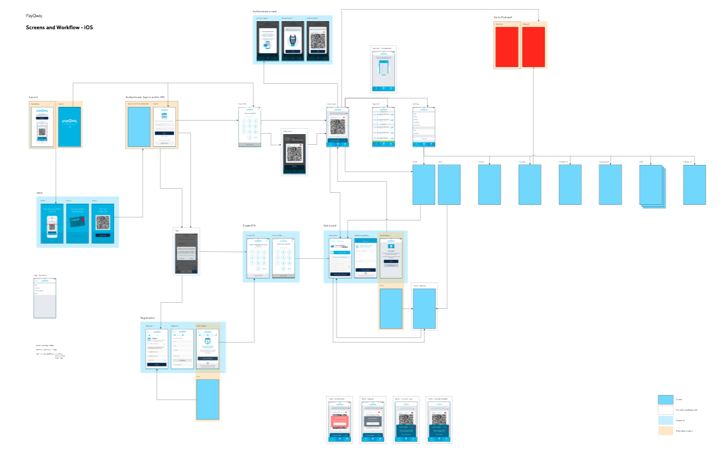
By the end of the redesign, I was finally able to create a map of the app’s screens:
Together with the workflow map, I also described the experience map of the first approach from before the download to after the first payment:
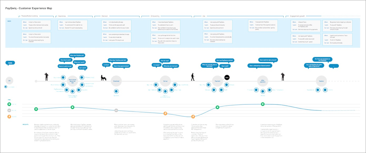

I printed the map and hung it on the wall, and it proved to be a great conversation starter to discuss current issues but also future potential developments.
Post-MVP features
After completing the MVP, I worked on some new features:
PayQwiq prepaid card
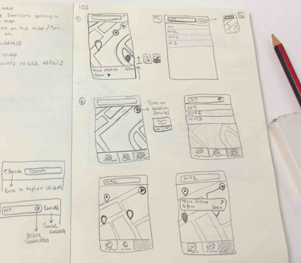
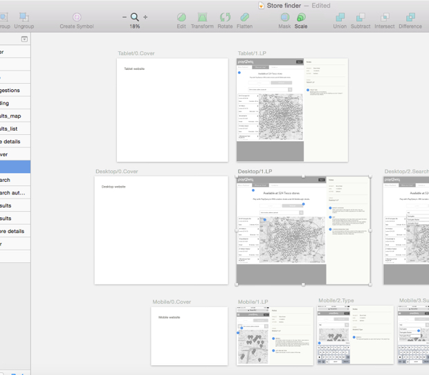
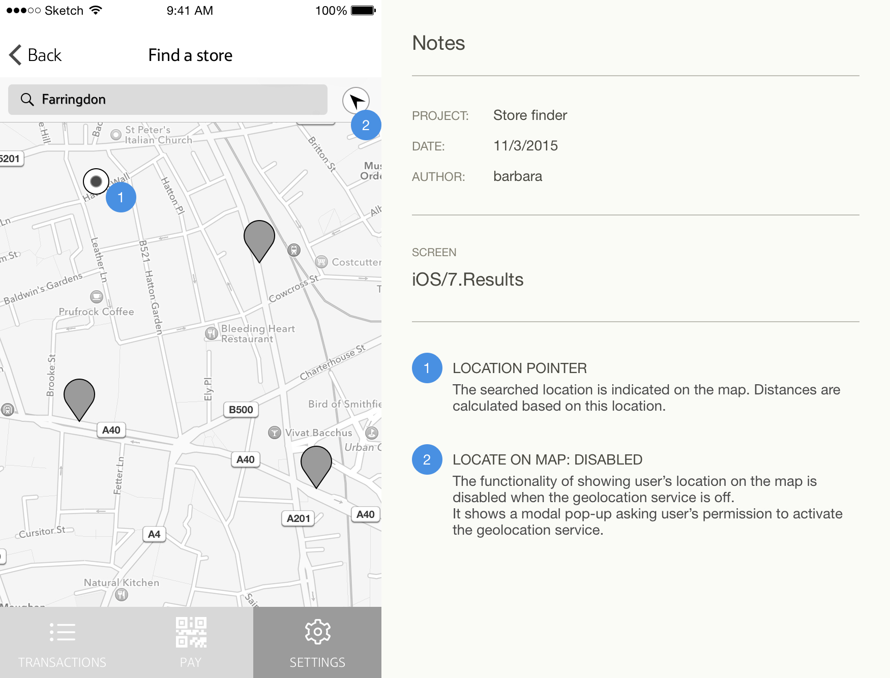
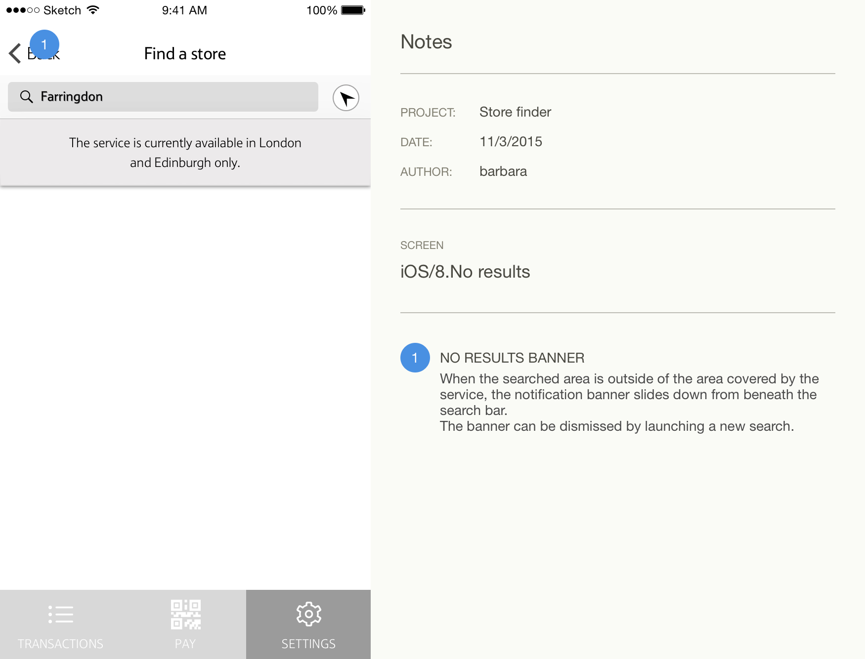
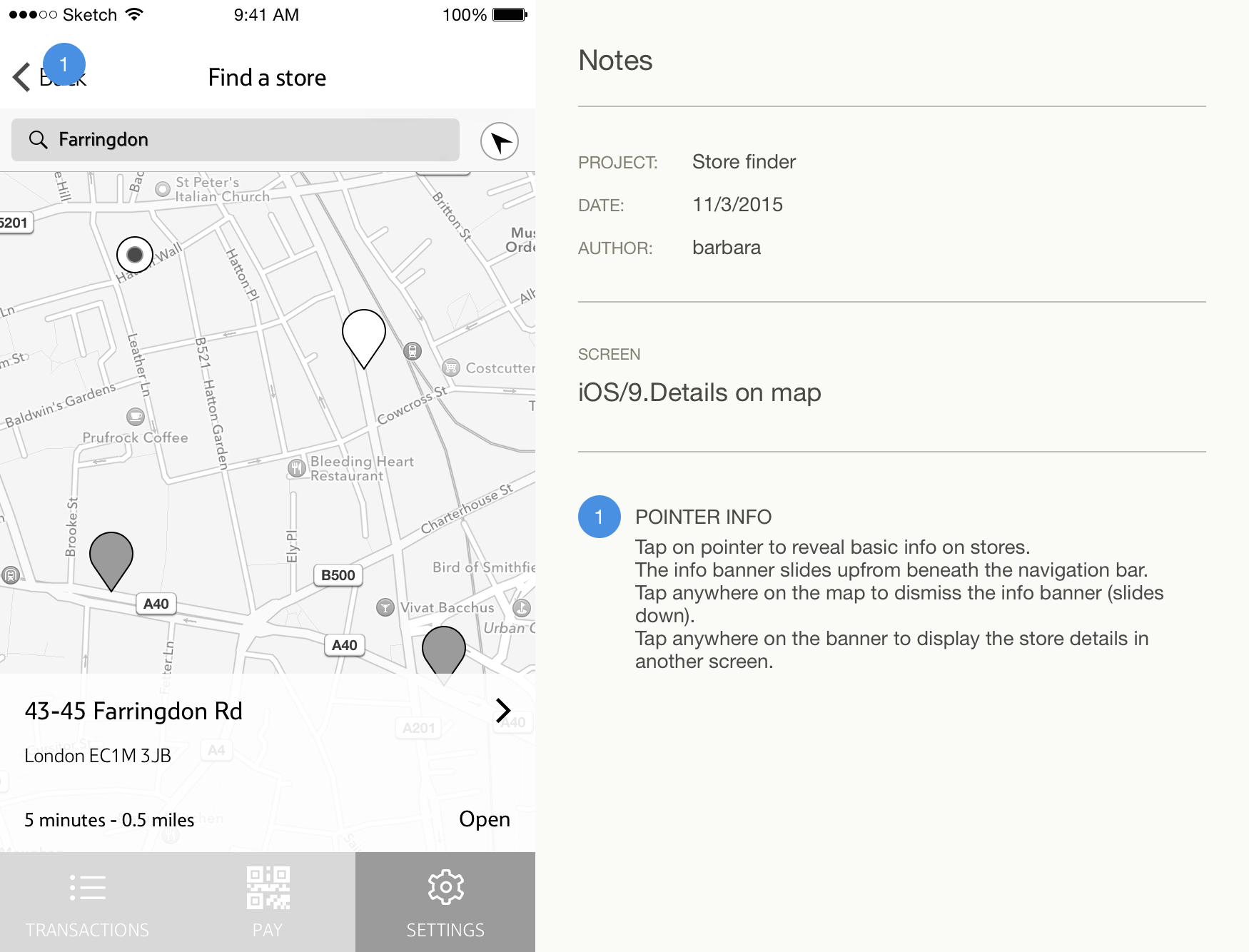
Store locator
Research and user needs culture
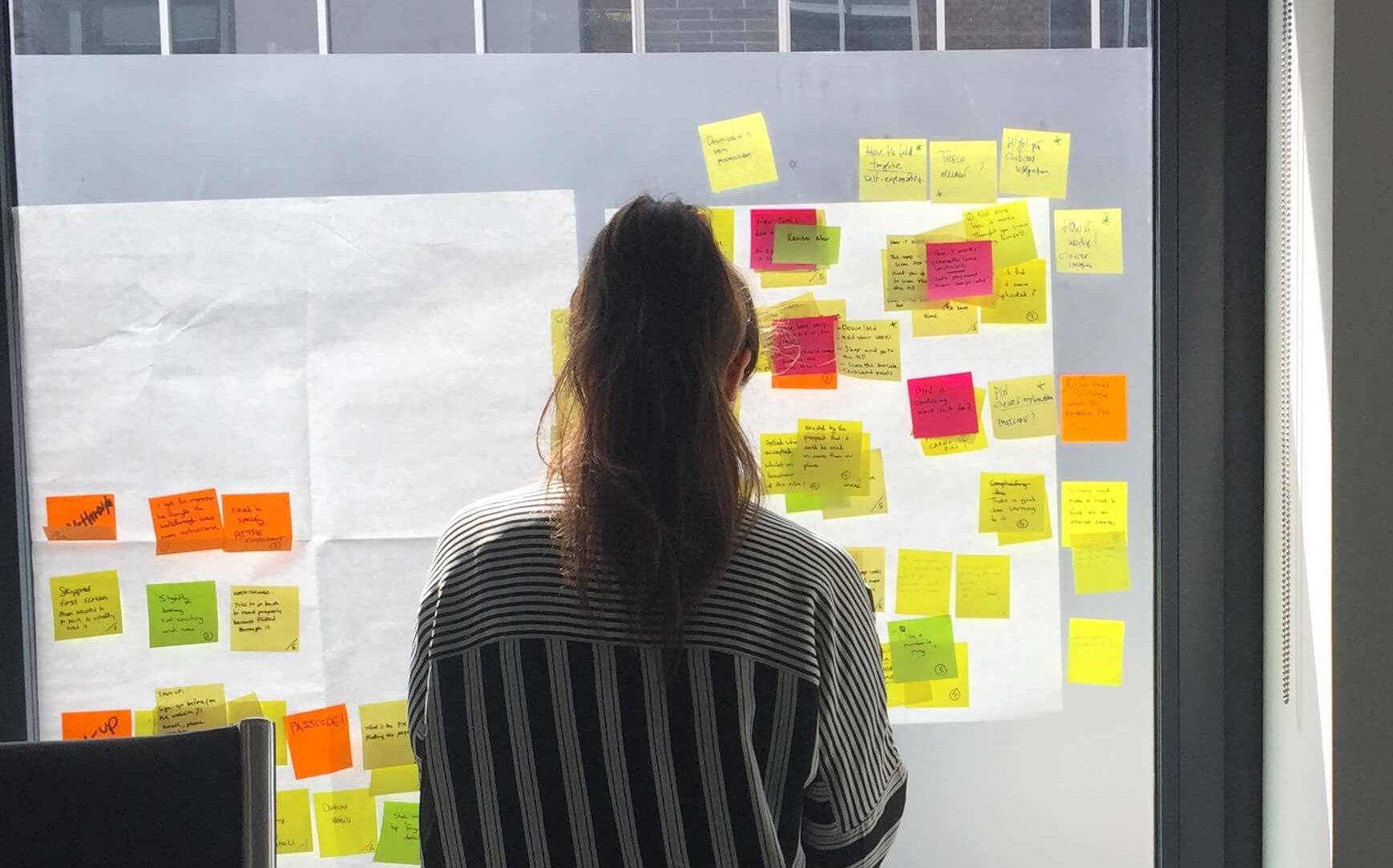
As part of my role at PayQwiq, I was also responsible for planning, facilitating and analysing user research.
The team had only started doing user research shortly before and they hadn't fully integrated research and a user-centered approach into the development flow yet.
I made sure to involve all the Product team members in the research sessions, when possible, and it was extremely useful for them to see first hand how people interacted with the app.
Together with some standard lab-based testing, I also organised some sessions in store. With a GoPro strapped on, our testers were asked to complete some real-life task by using a realistic prototype of the app.
I have a lean approach to research, in my experience research is most useful when can be turned quickly in insights and therefore, in actions. A smart approach to taking notes allowed me to share my findings as soon as a few days after the test.
I also created a research repository that showed how the app’s performance had evolved over time.