Irista Onboarding
I led the redesign of the onboarding experience in Irista across Web, iOS and Android over a one year-long project.
When I started working at Irista, one of our key goals was to improve our conversion and retention rates.
We could see that there was a big gap between visits and sign ups and that when people were taking the decision to sign up and use Irista, most were not coming back. To start with, we needed to understand what was preventing people to sign up and come back to Irista. I run a round of interviews with new users on Web, iOS and Android and that helped me to create a map of the current sign up and onboarding journey at the time.
The experience map proved to be useful to uncover some crucial problems:
■ People were asked to sign up with Canon ID, Canon’s interconnected registration and account management service, but the link with Irista wasn’t clear and people expressed how it was a cause of mistrust for them.
■ The sign-in form was much more prominent than the sign-up form. During user testing, every user mistakenly used the sign-in form to create their account, only to be presented with an error message.
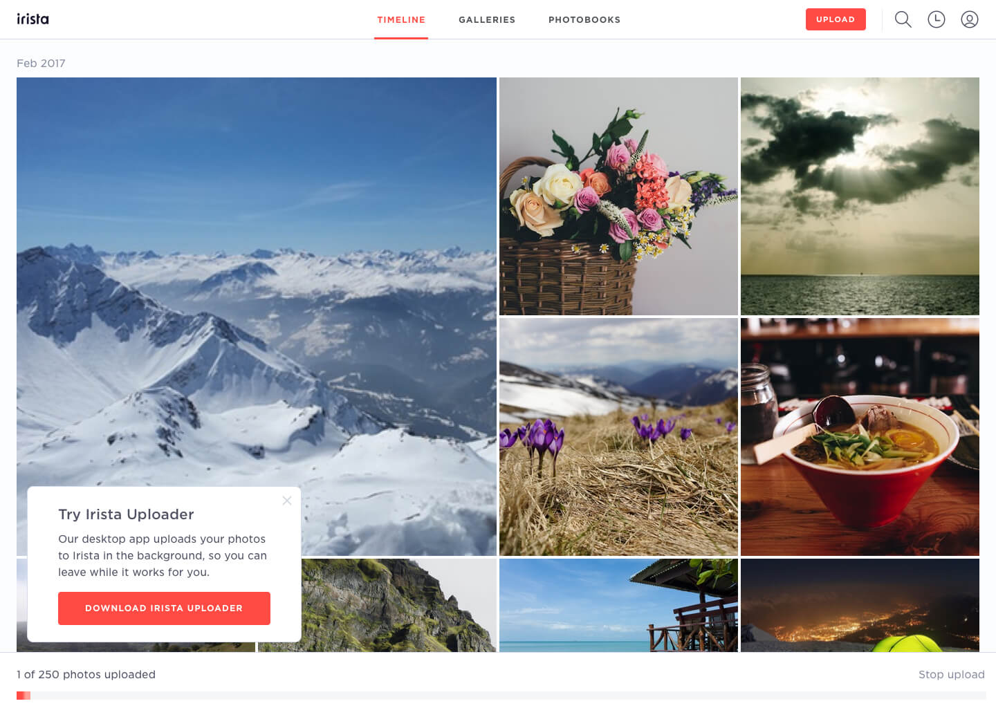
■ After signing up, people were presented with some set-up choices which purpose wasn't immediately clear, like enabling Facebook import and downloading our desktop app. These options were presented too early in the journey and were not relevant for what users needed to do at that step of the journey.
■ Once users finally made it inside Irista for the first time, there wasn’t any guidance or suggestions about where to start first and they felt lost.
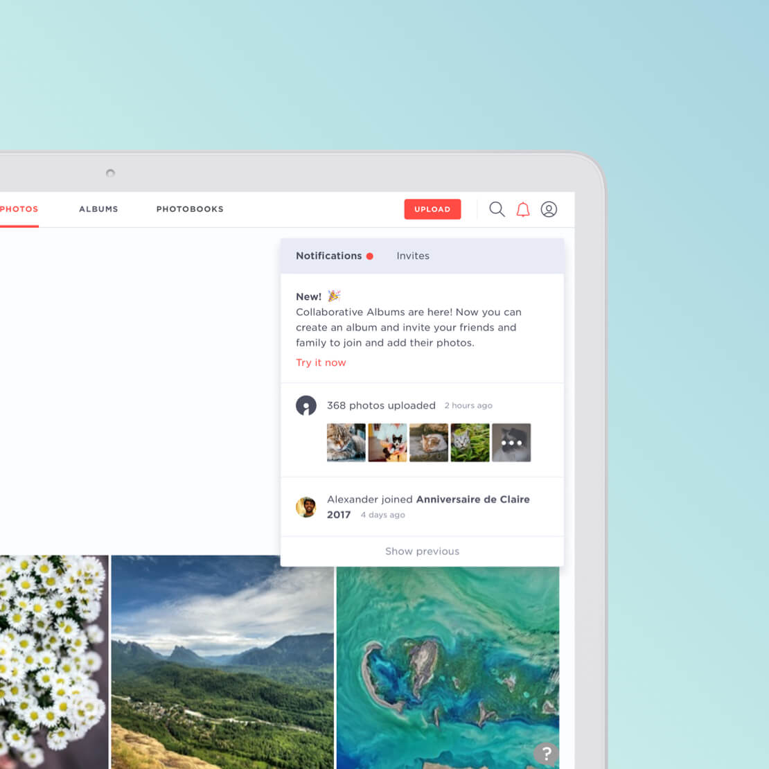
■ There was no further communication with users after sign-up, due to the lack of a content strategy.
After having identified these problem areas, it was easy to break the work down in three different streams: improving the sign-up experience with Canon ID, reviewing the onboarding flow, introducing a lifecycle messaging strategy.
Fixing conversion
I started working on the sign-up experience, tackling Web first.
Our data showed us that our conversion rate from the landing page wasn't performing well. I run a few contextual enquiry sessions with users and noticed that the sign-up form, tailored more for existing users than for new users, was creating some confusion.
First, I moved the 'Sign in' button from the hero to the top navigation, leaving only one call to action prompting users to 'Get started'. I also created a specific entry point for new users to create a new account. I mocked the transition in Framer, which helped speed up the handover to development.
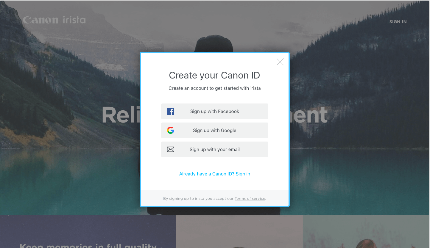

On mobile, in order to make the transition between Irista and Canon ID more seamless, I explored a solution to display the initial steps in the app so that it could feel more like a fluid process, and to display the remaining steps in an embedded web view instead of redirecting users to the browser.
The key to a successful onboarding
With a wealth of research insights and the understanding of what was wrong with our onboarding at the time, it was time to define what would be a successful onboarding for our users. I looked at our internal data and considered the length of retention and volume of content uploaded as our two key happiness metrics. That’s when I found a revealing trend in users who showed the highest score on both variables: they all uploaded more than 10 pieces of content during their first day and created at least one album during the first week. These insights helped me deciding what tasks were best to highlight during the onboarding so that all our users could be on the right track to becoming happy users.
The principles behind the redesign intended to create a ‘happy path’ for our users without being prescriptive so that people could make the most of Irista from day one.
The onboarding focused around 4 steps:
- Adding content
- Organising content in albums
- Sharing albums
- Exploring content
I started working on the Web onboarding first. I created the user flow, then I worked on a few iterations of mockups and prototypes in order to test the concept with some users.
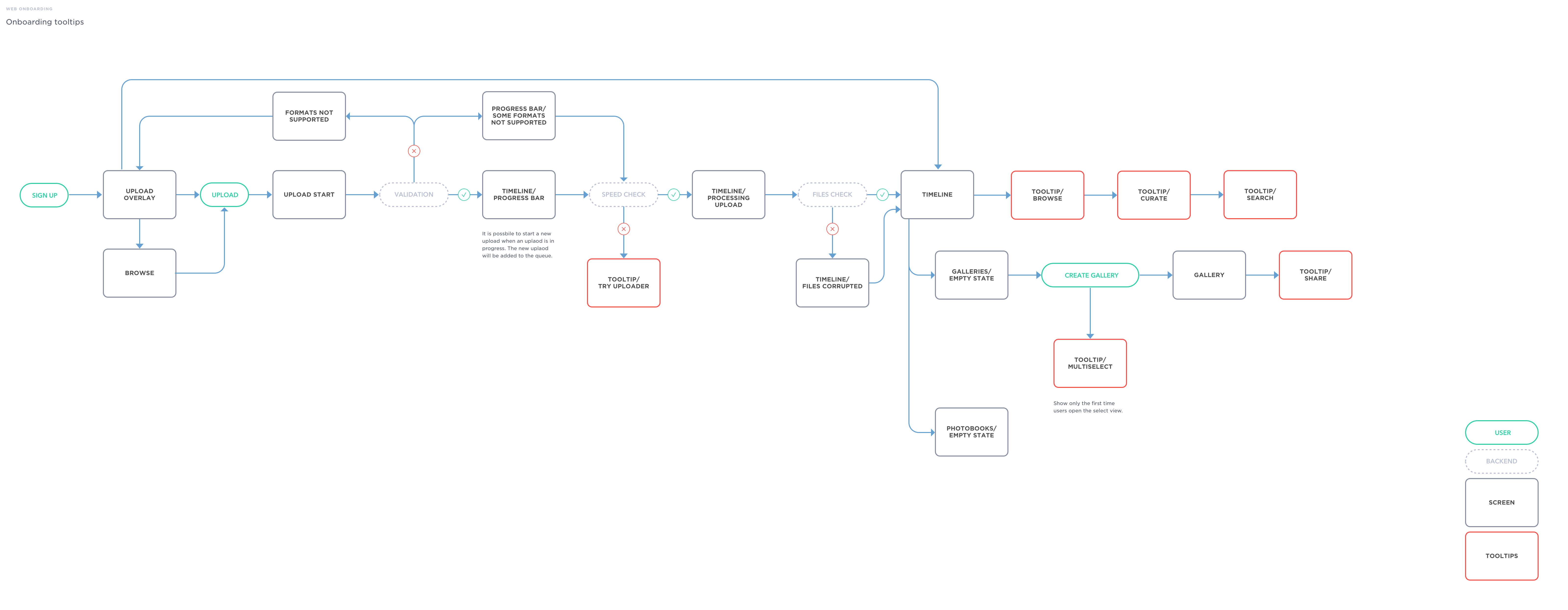

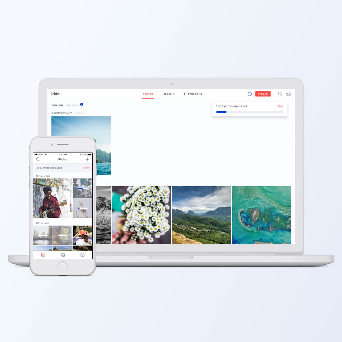
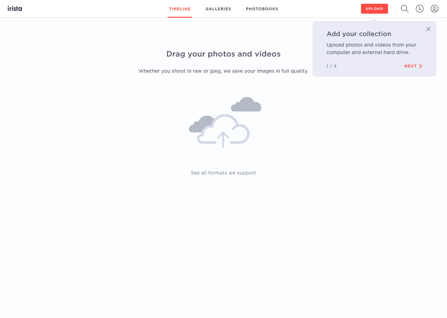
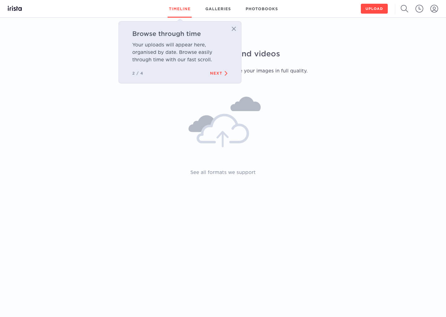
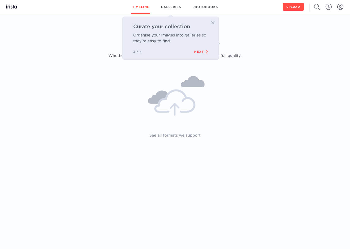
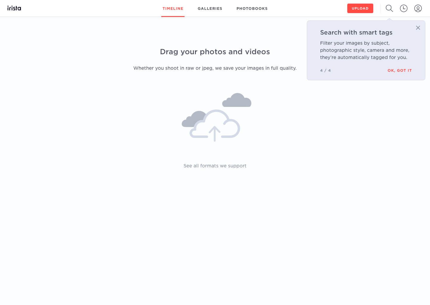
Overall, I run three rounds of testing. Each round helped me narrow down the user needs and refine the next iteration of the design. In the end, I was able to create a concept based on the introduction of some initial tooltips followed up by more contextual tooltips, appearing only when users initiated some specific tasks.
This approach provided us with the key benefit of showing users only the instructions that were relevant to them at the time they needed them. The initial tooltips were designed to provide the right amount of information needed to give new users an overall idea of what to do next without overloading them. Then, the rest of the instructions were designed to be progressively shown based on each user's personal journey.
In the weeks following the release, we have seen more people adding more photos to the platform and, as a result, we have also seen an increase in the average number of albums created.
After the success of the Web onboarding, I started working on the iOS and Android redesign. Both platforms followed the same flow.
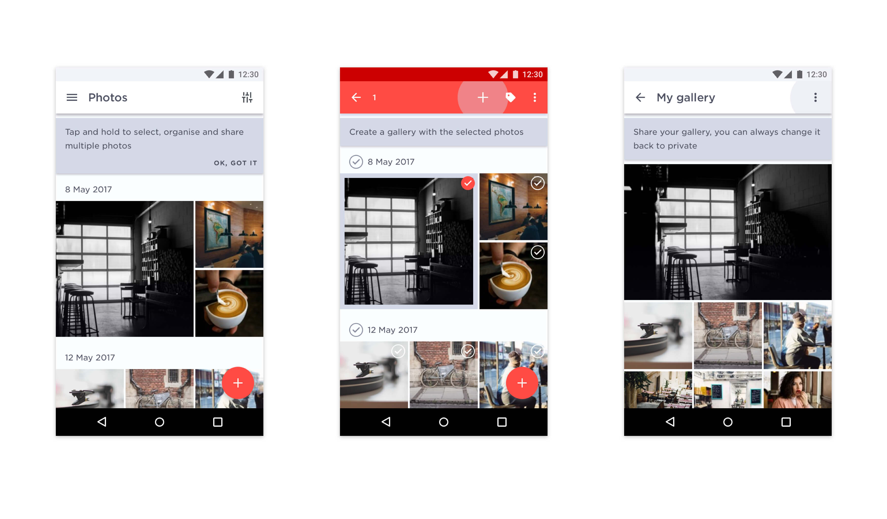
On mobile, we knew the main problems we had to solve were:
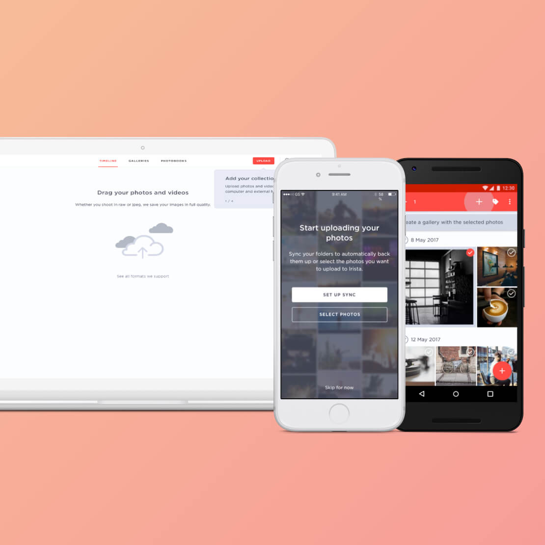
■ Helping users deciding what type of upload is best for them, manual upload or sync;
■ Helping them discover the multi-select option;
■ Prompting them to create and share albums.
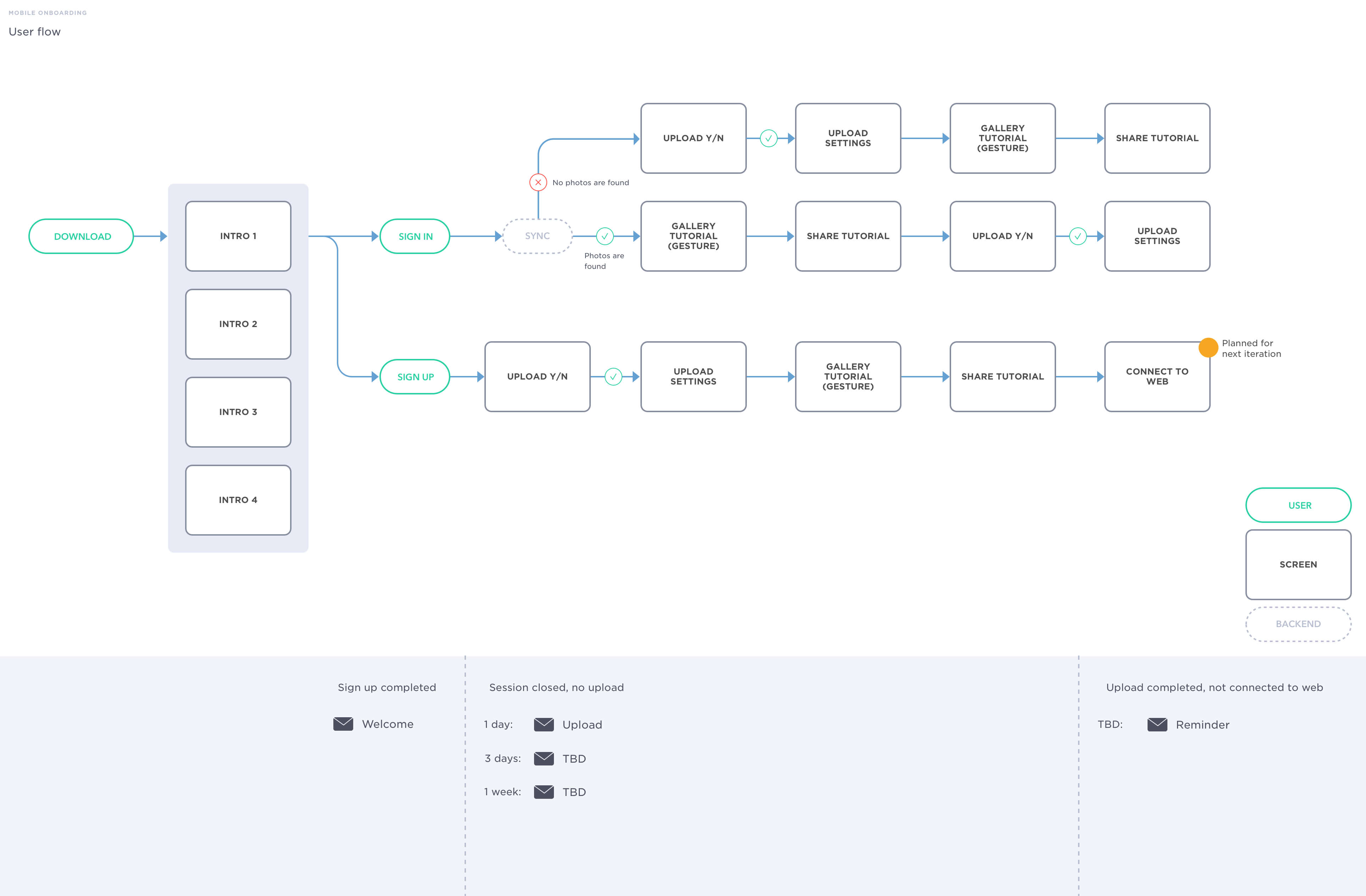

The new mobile onboarding journey simplifies the upload and provides guidance to get familiar with the app's core features, organising and sharing photos.
I worked on both platforms independently, adapting the designs to each platform’s specific patterns.
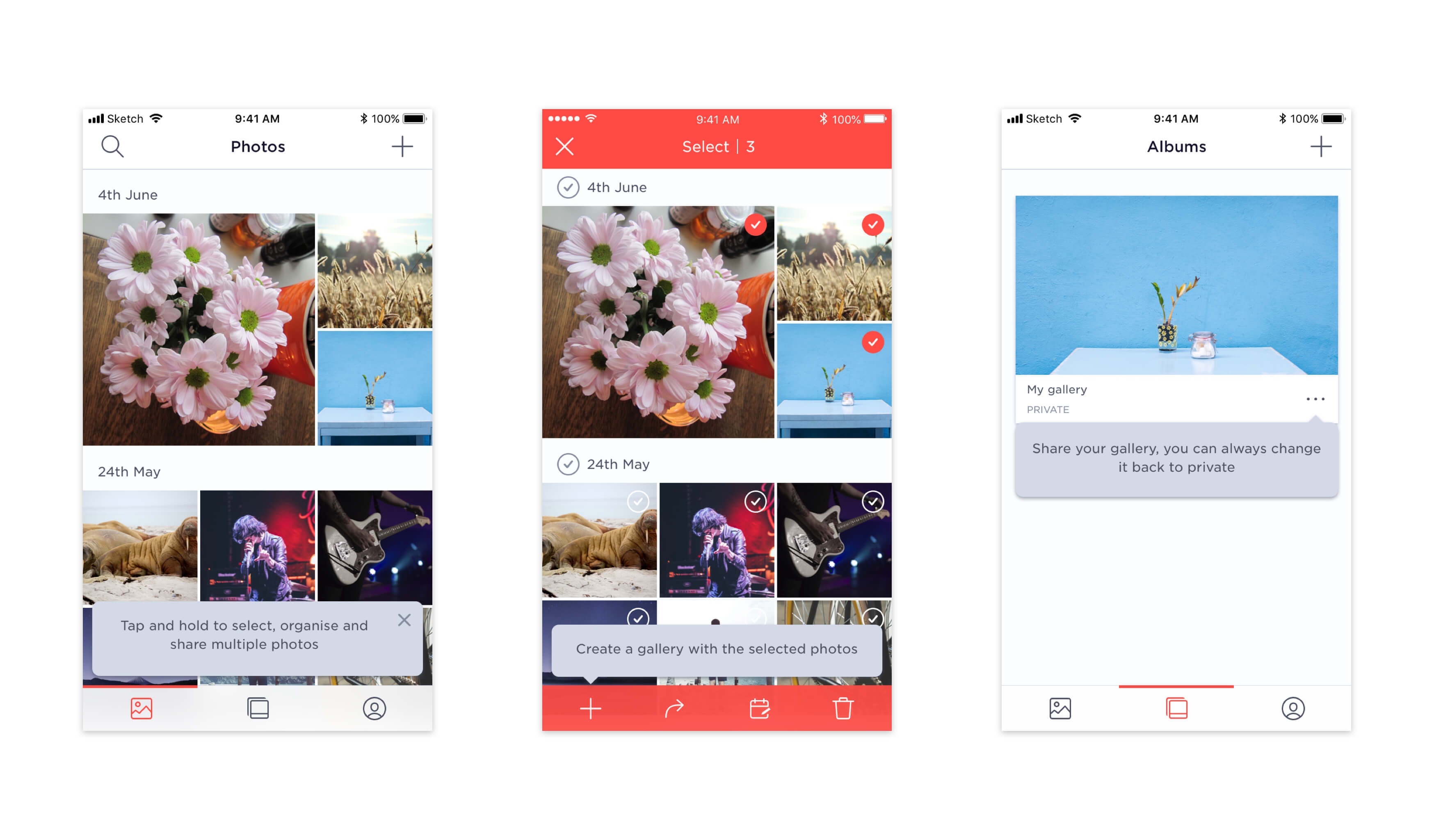

iOS

Android
Lifecycle messaging
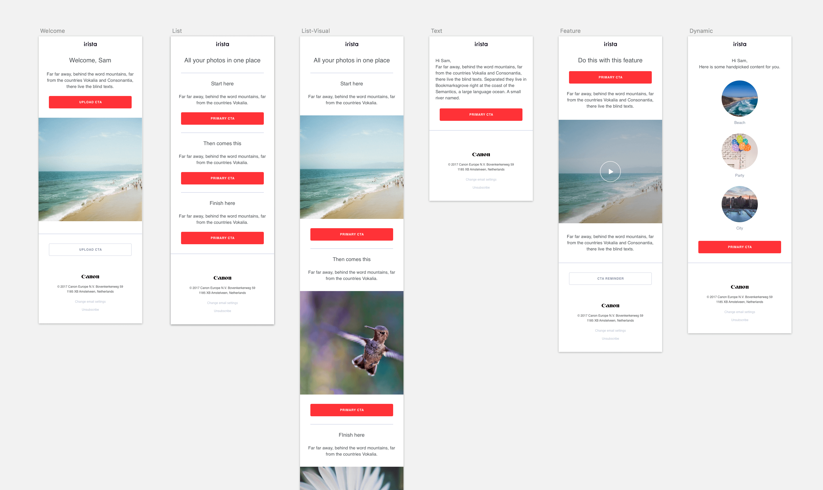
Alongside these improvements, I also helped the Marketing team to create the messaging strategy for the first 4 weeks of the customer lifecycle. I designed new email templates and facilitated several brainstorming workshops with the team to help identify the content for the emails.
In order to save the team time when creating the emails, I designed the components as building blocks, so that they could be reused to create different templates.
Results
In the months after the release of the new sign up, onboarding and comms, we reached our goal of having one million registered users globally. We also saw an increase in retention and engagement with the more advanced features in Irista.
